The photo above are a few bricks i had made by cardboard. What i did was tape the the rectangle and then colour the brick red. I was thinking of maybe adding some black in the corner, but i wanted to emphasis the the letter M and a new house that was made but was never used but is still falling apart.
This photo above is to show the actual size of the M letter. It was important to make this sculpture big in order to emphasis the idea of a big brand new house collapsing. What i did with this cardboard was then trace it on wood, cut out the wood bit and stick the cardboard onto the wood. This was necessary because i wanted to put plaster on the M, so if i hade put it on the cardboard by itself it would have cracked. So with the help of the wood it helped the plaster stand still and not crack.
The aim after this was then to stick the bricks onto the the side of this M letter wood piece.
Monday, 15 April 2013
Research photos!
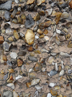
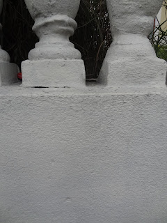
I went out with my camera to take different pictures of bricks and walls of houses. The purpose of this was so that i could pick one and see which i could actually follow and make.
Brick photos:
Wall Photos
My final Image.
This is my final idea for the my word Mortgage. Unfortunately the colouring is wrong here, so instead of the brown and grey it is just white. what i would be doing is cover it in plaster so that it looks like a wall house.
This photo above is an example of the plaster i used for my letter M.
Final Font!
So my final font for the Letter M for mortgage turned out to be called, " Maschinen". The picture below is an example of this. The reason why i chose this is mainly because the edges already make the M look like the corner of a house. It is solid looking and thought working with brick for the font would be easier.
It was also important to break the tip of the bottom part of the M so that it is slanted and looks like its breaking apart.
It was also important to break the tip of the bottom part of the M so that it is slanted and looks like its breaking apart.
Pushing it further.
So after my prototype i needed to push it futher and see what would work as an actual 3D piece. Here are some experiments that i went through while trying to figure this out.
When i finished drawing all of these different examples, i knew they were too decorative, so i stepped back and decided to forget about the grey top and just focus on the the letter M and bricks.
When i finished drawing all of these different examples, i knew they were too decorative, so i stepped back and decided to forget about the grey top and just focus on the the letter M and bricks.
Close to my final idea for Mortgage!
So i came to the conclusion that i wanted my final piece to falling down, almost like collapsing. I think this is important to portray how houses are not being used because people cant afford them and through time a perfect house begins to collapse. I have also researched that there have been many incidents where house business;s have pulled down houses because no one is living in them.
What i did here was pick different fonts and try to make them look like there are collapsing.
Final Word is Mortgage
My final word is MORTGAGE!
So comparing the two; Media and Mortgage. It was obvious to me that mortgage had more potential and pobably had easier tools the work with.
So shown throughout the pictures on the page, i have been experimenting and drawing my M letter with Wood. I thought that working with wood be simple, but once trying it out, i was not.
My ideas throughout these page are cutting out a M on Wood. Here to the left i was focusing on the sign post people have infront of their houses that say " for sale". I was experimenting also with drawing out houses with the font M.
Here were some measurments for my final idea.
However after discussing with my tutors, this was not exactly showing the idea of it being Mortgage.
So here to the left, i continued to look at more fonts and different ideas.
Testing out Mortgage
 Testing out Mortgage.
When thinking about mortgage i drew out all things that relate to Mortgage such as keys, wood, house etc
 I then began looking at the font where there are 3 solid big blocks at the bottom. I thought this was a good font mainly because it really shows the idea of it being bricks and it feels heavy .
The bottom 3 images however are too decorative
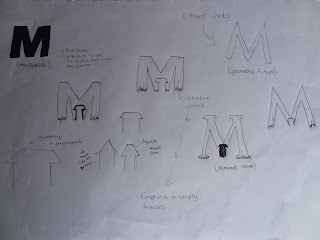
 I continued to experiment in connecting with the letter M to the word Mortgage, as seen below. Many of them are too decorative however some of them have some potential, for example the picture to the left where the M is falling down and breaking apart. It shows how Mortgage is a situation where things are collapsing.
Testing the word Media
Testing out Media.
So after all the experimenting of the other ideas i had for the letter M. It came to the end where i was deciding between Media or Mortgage. So what i did was try out the two and see which one has more potential.
So this picture to the left were just simple small media pics that is known worldwide. I was trying to see which picture would stand out the most and which one to go with.
I found myself getting a bit lost mainly because i was looking in too deep. So i stepped back and looked at all the things that relate to media. So as you can see i drew, all types of electronics and billboards. This is how we face
media in life.
When considering the Font to use for the word Media, i knew it had to be a bulky solid M, and definately in capitals. This would help emphasis is being a strong matter in life.
In this picture to the left, i had found a social media font and i began to think why not make a M out of all the symbols. But when doing this i realized it was too complicated and decorative.
Wednesday, 10 April 2013
Testing out my Final Ideas
Marriage
I thought Marriage at first was a good option mainly because it is a catholic tradition people still follow. Even though there are plenty who dont get married at all, i feel that ireland still however do get married.
Another situation that is ocurring in Ireland at the moment is that couples are getting married at a later age. Years ago, it was common that couples would get married at their early 20's, but now people are getting married in their late 20's early 30's
Mechanization
With the word Mechanization, i wanted to show how ireland still use their tractors, since ireland is a famring country. The picture to the left of the tractor is drawn wrong because it is too illustrated.
Money
Money is a big problem in ireland , especially the bank system. However i feel i didnt touch this as much as the other words because i kept thinking of ideas that were too cliche. So i decided not to look further into this word.
Military
When thinking for a few ideas for military, i began to think that ireland doesnt really have a strong military, and that right now it is not a current situation in ireland. So i felt militart did not strongly relate to Irelands nation. I didnt think my ideas were strong, so i decided to move away from this word.

Meat
Meat would have been interesting to look into. Especially with the whole situation of horse meat going around Ireland. However i felt that working with meat wasnt going to give me a limit amount of options, and also to be honest , i think that working with meat would be kind of disgusting.
Medicine
These ideas here to the left, are all wrong because they are too illustrated. I just wanted to see what materials i would be using, such as; pills, injections, cough syrup etc. Medicine was indeed one of my final ideas. After all medicine is necessary in every country.
My final M word Ideas
So it came to the point where i needed to cut down to a limited amount of words beginning with M that related to Irelands Nation. It was hard at first to cut down, buy as seen on my second web map. my final words were : Medicine, Mortgage, Marriage. Military,Middle class, Meat, Media Monarchy, Mobilization, Massacre, Mechanization, Middle Weight.
Different Fonts
These images below are a few different fonts that i had researched. I was eager to get a wide variety of fonts so that once i picked my final word that relates to the " state of the nation" it would be easier.
Thispicture to the left, are just cut out " M's " cut out of the magazine. It was intersting to see all the different type of " M's "that was used. Most importantly what i see here is how the background makes the M letter itself stand out alot more. For ecample look at the M with the pink background. With these bright colour it helps the letter look more interesting.
Subscribe to:
Comments (Atom)


